

Loyalty Servicing Dashboard
Role
UX Strategy, Research,
UX/UI Design, User Testing
Team
Lynne H. - Content Design
Annie B. - Product Owner
Seekers - Development Team
Duration
Q3 2025 - Q4 2025
Category
Finance, Credit Card, Loyalty Program
About the project
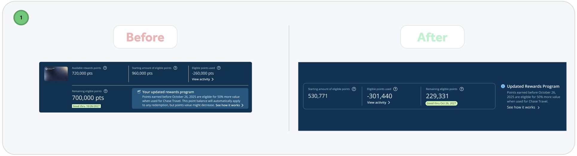
Account Overview is one of the most frequently visited page in Loyalty Servicing Platform, serving as the first destination users see immediately after authenticating a caller. However, our data revealed that users spent very little time on this page—an indicator that it added limited value to their servicing experience. This insight prompted an initiative to rethink and redesign the experience. I was the sole product designer owning this project end-to-end, from research to final delivery. Throughout the process, I collaborated closely with key partners across the organization to ensure the solution was user-centered, feasible, and aligned with business goals.
Collaboration:
Product owners: to understand the whole scope of the project and its requirements. There were a lot of new things we were introducing like the dashboard and revamping a few of the existing flows such as monetary value of card benefits, and reward balance tracker. Also, to collect feedback to get them sign off on the final design.
Engineers: to understand what data we can obtain via API, keep an open communication to understand the feasibility of implementing desired functionality, so we fail quick and cheap when things don’t work out. Most importantly, to ensure that the final output matched the design exactly.
Users: to understand existing pain points and needs, prioritize information and improve usability of this landing experience. Also, to get timely feedback on my design and how can new features and functionality help improve workflow efficiency.
Overview
Who are we doing this for?
The Loyalty Servicing Platform (LSP) is a centralized service portal used by over 50,000 card specialists and retail bankers to support Chase credit card customers. It enables agents to efficiently address customer inquiries related to Ultimate Rewards program, ensuring accurate and timely service within the Chase ecosystem.
What business objective are we solving?
Internal tools and the information available to agents should closely align with the customer-facing experience. This includes consistent language and terminology, enabling agents to communicate clearly and confidently, reducing confusion during customer interactions.
What user problem are we solving?
Our phone specialists need an intuitive and efficient workflow that enables them to quickly support customers. Especially the main landing page, it should be a cohesive experience and make information easy to access , with a transparent, clutter-free layout that enhances focus and minimizes friction."
The Loyalty Servicing Platform (LSP)
Where it all started
From Q4 2024 through Q4 2025, I led UX efforts supporting major business initiatives, including a Sapphire Reserve Card refresh and the launch of Sapphire Reserve for Small Business. These initiatives drove significant changes to the Account Overview page, where I translated complex business requirements—such as the Preserve Burn model—into clear, user-centric experiences. By introducing more tangible, easily understood benefits, I improved clarity, usability, and perceived value for customers while supporting critical business growth goals.
Frequent, quick-turnaround requests revealed a clear UX challenge: a high-traffic page that lacked the flexibility to scale with evolving business needs. Partnering closely with cross-functional teams and product stakeholders, I continuously integrated new data and content to ensure users always had timely, accurate information. In response, I designed a modular, scalable template for branded cards that supports both premium and no-fee products—such as Ink, Sapphire, Freedom Unlimited—creating a consistent, adaptable experience across the entire Chase credit card portfolio.
Understanding users
LSP specialists have different entitlements and servicing capabilities based on their agent level. These variations in responsibilities lead to distinct needs, motivations, and workflows across agent levels:
L3 and L4 specialists can view information and escalate cases.
L5 specialists have expanded capabilities, including adjusting points, processing redemptions, and resolving cases independently.
To better understand these differences, I conducted a round of user interviews. The goal was to uncover each specialist’s objectives, challenges, needs, motivations, and typical servicing patterns. This also allowed me to observe how they currently used the homepage and what value—if any—they gained from it.
Key Insights & Pain Points
Several consistent issues emerged across interviews:
Homepage lacked focus
Specialists struggled to quickly find key information relevant to their workflow. The content felt scattered and low-value.Critical data was hard to locate
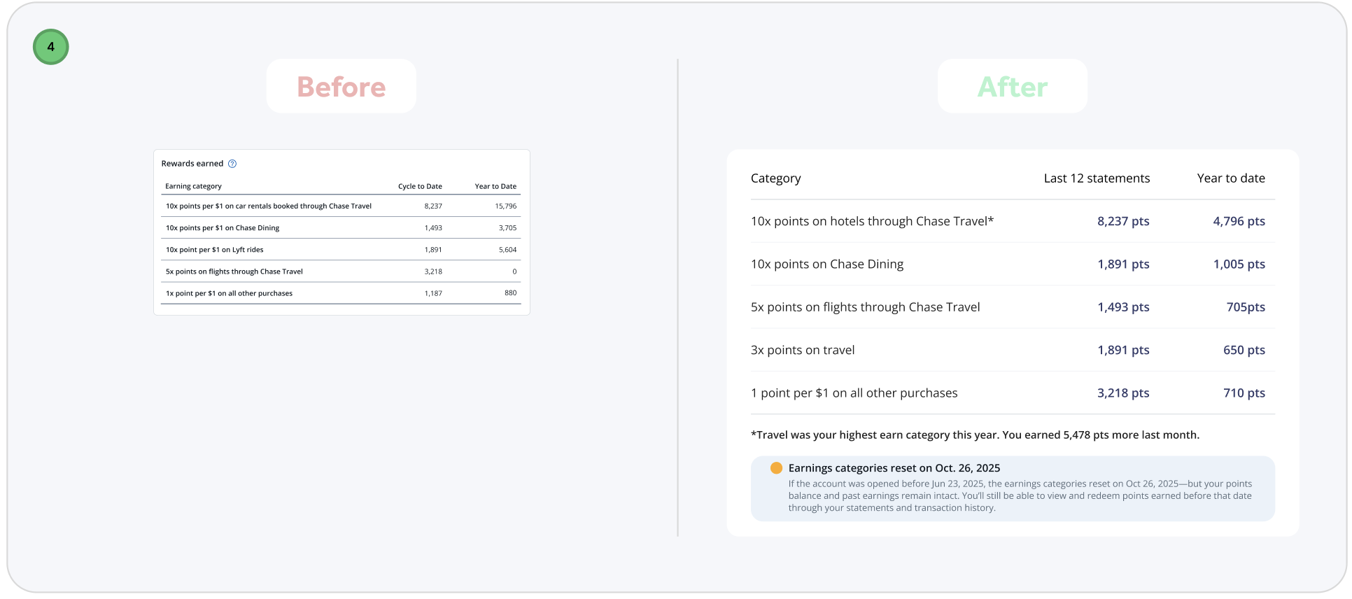
For example, sign-on bonus offers were not surfaced on the homepage. Specialists had to manually search for them, slowing down service time.Existing trackers were incomplete
Important contextual information—such as the remaining spend amount required for customers to reach a target—was missing. Agents often had to calculate it manually while on a call.Missing recent interactions
The homepage did not show recent orders or monetary benefit values, forcing specialists to dig through multiple sections to gather context.Poor visual hierarchy
The layout presented information without clear prioritization, making it harder for specialists to scan and act quickly—especially under time pressure.
Different Needs Across Agent Levels
Research clearly showed that L3, L4, and L5 specialists used the homepage in very different ways. Their workflows and priorities differed enough that a single, one-size-fits-all experience could not meet everyone’s needs.
To address this, I grouped specialists into three user profiles based on their goals, tasks, and empowerment levels. These profiles became foundational in shaping the redesigned experience, ensuring that each user type received the right information at the right time.
I also looked at other dashboards of popular platforms to further my reasearch on what a useful dashboard is comprised of. Some takeaways of what made them successful included:
Cross-linking key data elements
Informative data that is actionable
Data presented in filterable timelines
Insights shown at different milestones
Top customer inquires our phone specialists deal with:
Review Customer Account Information
• Check points balance, tier status, and recent activity
• Review account health indicators and flagAnswer Customer Inquiries
• Respond to questions about points, rewards, tiers, and program rules.
• Clarify redemption options and eligibilityProcess Points Transaction
• Credit or debit points for eligible activites
• Reverse or correct erroneous transaction
• Handle points expiration and reinstatement requestFacilitate Rewards Redemption
• Assist with redeeming points for merchandise, travel, gift cards, etc
• Troubleshoot failed or incomplete redemptionsInitiate & Track Service Requests
• Open, update, and close cases for customer issues.
• Escalate complex cases to specialized teams.
Jobs-To-Be-Done

Starting with Questions
1. How may I provide an experience that is engaging and valuable to our users?
2. How might I enable specialists to easily access the most critical customer information through LSP?
3. How might I provide a tailored experience that helps phone specialist reduce call handle time?
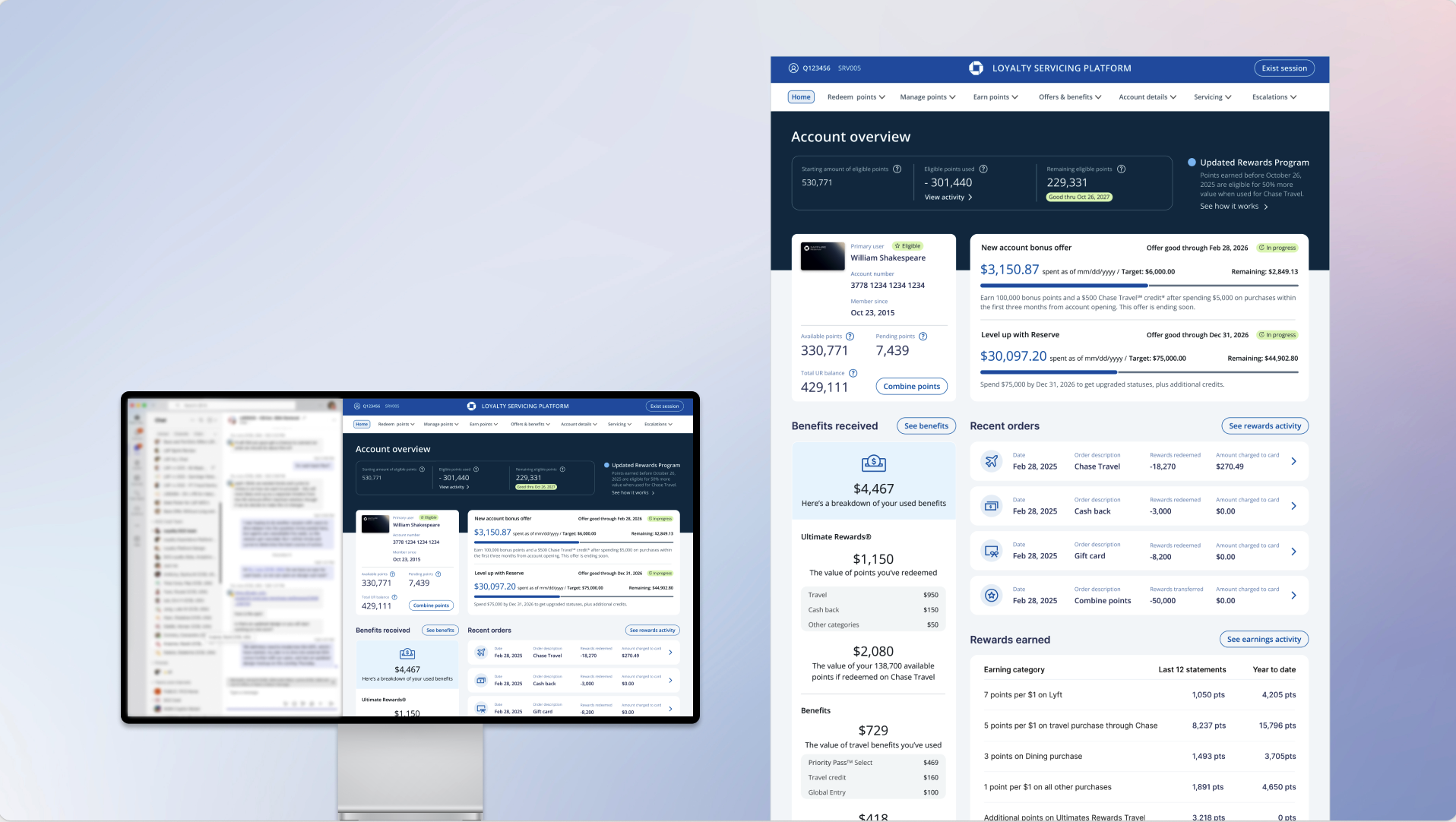
The MVP
To validate my research findings, I designed a brand-new dashboard that surfaced the most requested customer information and introduced quick-action buttons for frequently performed tasks. I also restructured the content hierarchy to make the page more scannable and intuitive. This prototype enabled more meaningful conversations with LSP specialists—many expressed that the new additions significantly improved their workflow. More importantly, I observed a noticeable decrease in dashboard drop-offs, indicating that the redesigned experience was delivering greater value and engagement.
Learn, revise, and test again
Based on my findings shown above, I narrowed my focus into four areas for potential improvement of our original Account Overview design:
Improve the data we provide
Improve on page navigation
Improve actionability
Improve feeding user data in small chunks
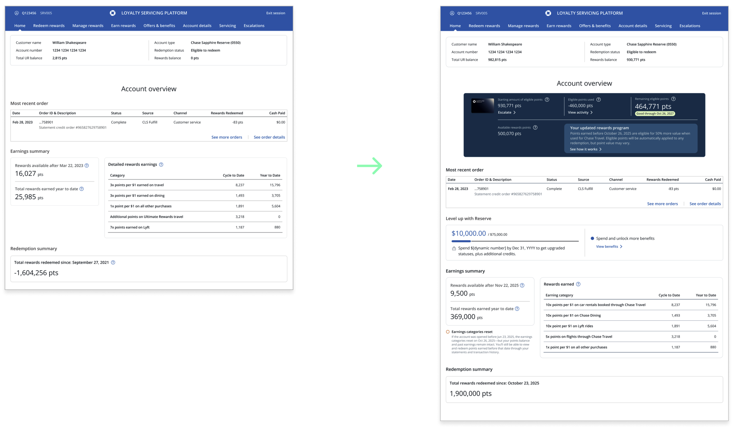
After incorporating feedback from the first round of usability testing, I conducted a second round to validate the design iterations and answer more specific UX questions. This phase focused on testing high-fidelity wireframes, allowing me to evaluate whether key elements—such as the Total Value Scorecard tile—were noticeable and whether the page effectively supported primary call drivers.
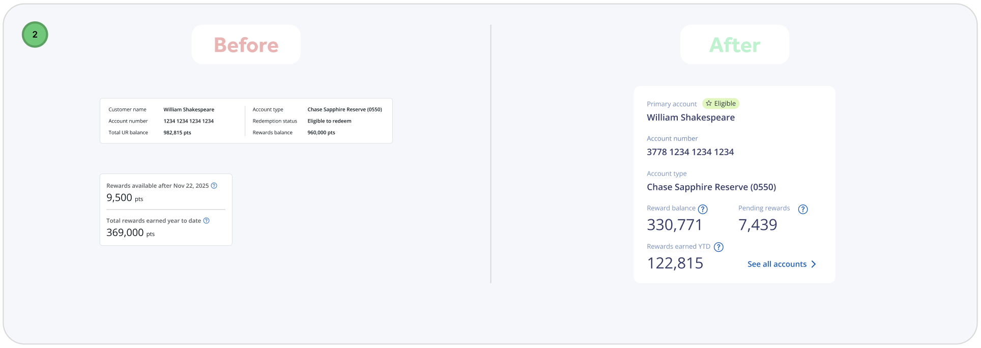
During testing, users immediately engaged with the tile-based layout.
The Total Value Scorecard stood out in particular, generating excitement and prompting users to comment that it would be extremely helpful during retention conversations.
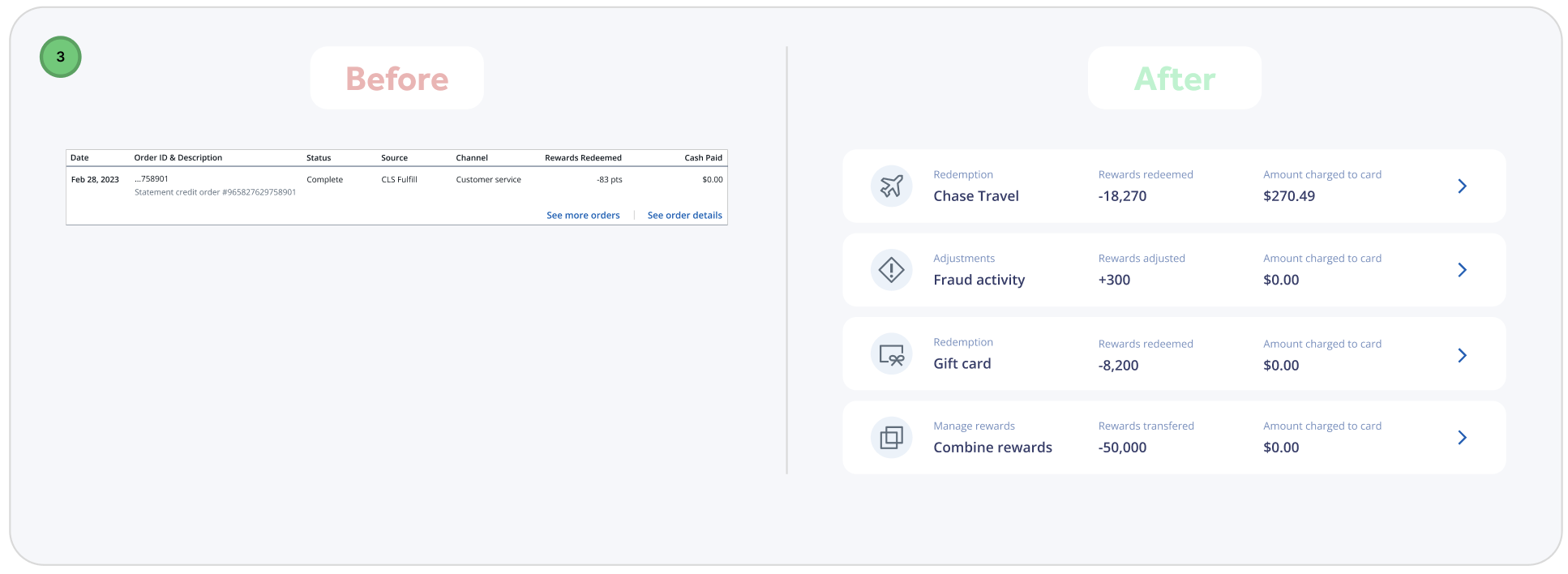
Users also responded positively to being able to access order details directly on the page. Removing the need to navigate elsewhere was seen as a time-saver during calls, while the quick-action button for point redemption made completing common tasks faster and more intuitive.
Making all active offer tracking visible on the page further reduced friction. Users noted that having this information centralized eliminated the need to search across multiple screens for customer details, improving efficiency and focus.
Finally, participants praised the visual hierarchy of the page. Larger, more prominent numerical values made key information easier to scan and understand quickly, supporting faster decision-making during live interactions.
Overall, this round of testing validated that the design changes improved clarity, efficiency, and confidence for users while directly supporting real-world call center workflows.
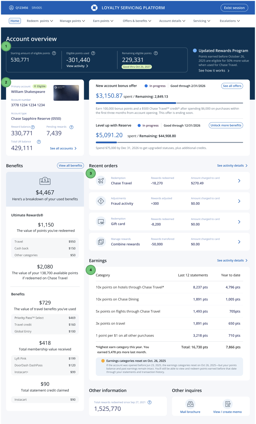
Final Product
By the second round of usability testing, the number of issues uncovered was noticeably smaller and far less severe. This confirmed that the earlier design iterations had successfully addressed the core usability challenges. With two rounds of validation complete, I focused on making final refinements—polishing micro-interactions and improving overall ease of use.
These final adjustments were guided by three core design principles that emerged throughout the research and testing process:
Intuitive and Efficient Workflows
Agents often handle complex, non-linear issues, so the platform needed to support fluid movement between tasks without disrupting their progress. The design prioritizes speed and support quality by surfacing the right information at the right moment, allowing agents to stay focused on the customer rather than the interface.Contextual Customer Information
Once a user is authenticated, agents are presented with a holistic view of the customer. This includes profile details, account information, previous interactions, and relevant sentiment or intent signals. Having this context readily available enables agents to deliver more informed, personalized support.Clutter-Free Interface
As a data-heavy platform, LSP required careful balance between functionality and clarity. Reducing visual clutter while preserving essential capabilities was key. Clear navigation, well-defined call-to-action buttons, ample white space, and scannable, up-to-date content help agents quickly find what they need and work with confidence.
Together, these refinements ensured the final design was not only usable, but scalable, efficient, and aligned with real-world support workflows.
Next steps
As I developed a broader strategy to scale this design across additional card products, I identified opportunities to extend the experience to business credit cards and no-membership-fee cards. This ensured the solution remained flexible and adaptable to different customer segments.
Looking ahead, I also planned the introduction of a robust search capability within the account overview page. This feature would enable agents to quickly locate accounts, transactions, and customer details, further reducing friction and improving efficiency during support interactions.